
CSS Doodle provides framework for grid based CSS animations and textures

Submitted by daniel on
Image (node)
Image
Hexagonal pattern created with CSS Doodle

Using front end tools and frameworks that utilise the canvas element can offer impactful looking pages but often come with a heavy overhead, especially when running animations and effects in the web browser and this overhead often correlates to the the dpi, which on most desktops and even mobiles is usually quite high. Developing such visual enhancements can be expensive in terms of time to produce and the amount of energy required to run for your average mobile or tablet user. Therefore it's good see some alternatives that leverage css, web components and the shadow dom and css transformations with support for hardware acceleration, to facilitate developers to create fully immersive website experiences with out some of this overhead. 

@grid: @p(3,4,5) / 80vmin; :container { gap: 4px; } transform: rotate(@p(0, 90, 180, 270)deg); background-image: @doodle( @grid: @p(1, 2, 3) / 100%; :container { gap: 4px; } transform: rotate(@p(0, 90, 180, 270)deg); background: @m(@r4, (radial-gradient(circle at @pn(0, 100, 100, 0)% @pn(0, 100, 0, 100)%, @p(#689FC0, #CF6756, #543235, #F6C7C8, #ECBB3F, #4B639D, #5A8863, #DE7970, #FDF9CC) calc(35.36% - 2px), #000 calc(35.36% - 1.5px), #000 calc(35.36% + 2px), transparent calc(35.36% + 2.5px)))), linear-gradient(@p(#689FC0, #CF6756, #543235, #F6C7C8, #ECBB3F, #4B639D, #5A8863, #DE7970, #FDF9CC), @lp); @random(0.2) { background: linear-gradient(@p(#689FC0, #CF6756, #543235, #F6C7C8, #ECBB3F, #4B639D, #5A8863, #DE7970, #FDF9CC) calc(50% - 2px), #000 calc(50% - 1.5px), #000 calc(50% + 2px), @p(#689FC0, #CF6756, #543235, #F6C7C8, #ECBB3F, #4B639D, #5A8863, #DE7970, #FDF9CC) calc(50% + 2.5px)); } @random(0.2) { background: @m(@r2, (radial-gradient(circle at @pn(0, 100)% 50%, @p(#689FC0, #CF6756, #543235, #F6C7C8, #ECBB3F, #4B639D, #5A8863, #DE7970, #FDF9CC) calc(44.3% - 2px), #000 calc(44.3% - 1.5px), #000 calc(44.3% + 2px), transparent calc(44.3% + 2.5px)))), linear-gradient(@p(#689FC0, #CF6756, #543235, #F6C7C8, #ECBB3F, #4B639D, #5A8863, #DE7970, #FDF9CC), @lp); } @random(0.2) { background: radial-gradient(circle at 0 50%, @p(#689FC0, #CF6756, #543235, #F6C7C8, #ECBB3F, #4B639D, #5A8863, #DE7970, #FDF9CC) calc(44.3% - 2px), #000 calc(44.3% - 1.5px), #000 calc(44.3% + 2px), transparent calc(44.3% + 2.5px)), radial-gradient(circle at 100% @p(0, 100%), @p(#689FC0, #CF6756, #543235, #F6C7C8, #ECBB3F, #4B639D, #5A8863, #DE7970, #FDF9CC) calc(35.36% - 2px), #000 calc(35.36% - 1.5px), #000 calc(35.36% + 2px), transparent calc(35.36% + 2.5px)), linear-gradient(@p(#689FC0, #CF6756, #543235, #F6C7C8, #ECBB3F, #4B639D, #5A8863, #DE7970, #FDF9CC), @lp); } @random(0.2) { --color: @p(#689FC0, #CF6756, #543235, #F6C7C8, #ECBB3F, #4B639D, #5A8863, #DE7970, #FDF9CC); background: @m(2, (linear-gradient(@pn(180, 90)deg, @pn(transparent, var(--color)) calc(100% - 4px), #000 calc(100% - 4px)) no-repeat 0 0 / calc(50% + 2px) calc(50% + 2px))), @p(radial-gradient(circle at 0 0, @p(#689FC0, #CF6756, #543235, #F6C7C8, #ECBB3F, #4B639D, #5A8863, #DE7970, #FDF9CC) calc(35.36% - 2px), #000 calc(35.36% - 1.5px), #000 calc(35.36% + 2px), transparent calc(35.36% + 2.5px)), linear-gradient(@m2(transparent))), linear-gradient(@p(#689FC0, #CF6756, #543235, #F6C7C8, #ECBB3F, #4B639D, #5A8863, #DE7970, #FDF9CC), @lp); } );
Grids

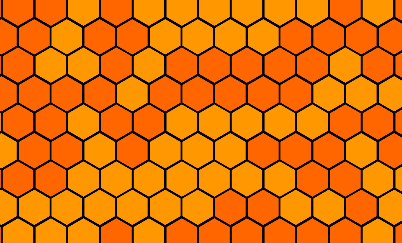
Looking at their repo, it looks like CSS Doodle has been out for a couple of years now at the time of writing. This framework allows developers to divide the page up into a grid like matrix. Just like graphics processors can use the graphics card to render colour and effects for each pixel on the screen, here developers can use CSS to manipulate each square on the grid matrix.

CSS-Grid's framework is fully featured and provides a range of custom functions to help you achieve the effect that you want. You can namespace each CSS Grid component that can be loaded on any page and even attached to a global css file.

CSS Grid is a really powerful framework that offers some exciting new possibilities to provide feature rich animations and effects that achieves its in a truly web new and optimised for the web.

Examples

This simple example shows how you can use css grid to create a simple grid containing  5 x 5  squares constrained within a a 8em  container. The background of the entire grid is set to #60569e with a 1px gap between each square. Note how the styles are contained within the doodle pseudo class e.g. :doodle.

:doodle { width: 8em; height: 8em; gap: 1px; } background: #60569e;
CSS Doodle
<css-doodle grid="5">
  :doodle {
    width: 8em; height: 8em;
    gap: 1px;
  }
  background: #60569e;
</css-doodle>

This example how you can assign your CSS Doodle styles to a css variable and then assign them to any css-doodle Web Component that can be inserted within your HTML. This is a preferred method when moving to production and can also be compiled and bundled with your global site wide, page or component specific regular css. Here the css variable --rule has been added within the css-doodle tag that contains our css-doodle --rule variable. Note how we also reuse and assign the --d and --lg variables within our css-doodle targeted component.

Fireworks

This code is responsible for generating this nice fireworks effect.

<style>
  css-doodle {
    --rule: (
      @grid: 5 / 8em;
      --d: @p(45deg, -45deg, 135deg, -135deg);
      --lg: linear-gradient(@var(--d),#60569e 50%,#0000 0);
      background:
        @var(--lg) 0 0 / 100% 100%,
        @var(--lg) 0 0 / 50% 50%;
    );
  }
</style>
<css-doodle use="var(--rule)"></css-doodle>

More Examples

https://codepen.io/collection/XyVkpQ/?cursor=eyJwYWdlIjo4fQ==

Add new comment

Filtered HTML

  • Web page addresses and email addresses turn into links automatically.
  • Allowed HTML tags: <a href hreflang> <em> <strong> <cite> <blockquote cite> <code> <ul type> <ol start type> <li> <dl> <dt> <dd>
  • Lines and paragraphs break automatically.